The Guts Are the Glory
- Sep 26, 2017
- 12 min read

Practicing complicated or bespoke Tableau development techniques is valuable, even if it doesn't always translate to popular acclaim.
There’s barely anything flashy about my submission for Makeover Monday this week, which was an analysis of adherence to various restrictive diets by people in five different regions of the world.
The dashboard is in a 1000x1000 square canvas, my recent dimensions of choice.
The top half of the viz leads off with a headline, followed by some text, followed by more text. Then it shows one horizontal chart with some annotations.
The bottom half has two quarter-viz-sized boxes side by side, showing deeper dives into the data on two different dimensions. The very bottom strip is my traditional credits/sources/vanity photo footer.
Here’s the screenshot. Click on through it if you want to see the workbook.
Essentially, we have a fair bit of Tableau font family text, three smallish dot-plot-esque charts (two of which use only the bone-basic blue and orange colorblind hues, along with a muted gray), and that’s it. No Unsplash or Pixabay images for decoration; no custom icons; no Photoshopped header.
There’s no visual wow factor, no distinctive chart type, no rainbow palette…not even a smidgen of caustic humor. It isn’t even very mobile-friendly, thanks to the dimensions I chose and the fact that I used a long horizontal chart with floating text boxes all around it.
So it’s no surprise that in the hey-hey-HEY-look-at-me world of the internet, this was not a particularly well-received work. It sure isn’t going to grab your eyeballs by the rods and cones. Frankly, it looks pretty basic.
And while I don’t pull specific metrics from my social media channels, I can tell by Tableau Public clickthroughs and the deafening silence of my Twitter notifications that it was not particularly popular.
Before we go any further, I want to say: a person could begin reading this post and get the impression that I am merely throwing myself a pity party because I think I deserve, or my work deserves, more attention. This is not the case. (I mean, I’ll ACCEPT more attention. I don’t look gift likes and retweets in the mouth.)
I just want to talk about the elements of good dashboard design that don’t tend to be attention-getting. These elements are hard to see in a screenshot on Twitter, but are essential to creating successful products in the real world. This week I chose to focus on those under-the-hood elements, knowing that the final product would be less immediately engaging.
I submit for the community’s consideration that, if personal development is a reason why you participate in the Makeover Monday initiative, then it is worth using some weeks to intentionally focus on different elements of dashboard development than the single goal of “I want this to look pretty.”
What other considerations, in the real world, determine the success or failure of a product? Given the data at hand, and an unspecified customer and mission, I would want to do a few things:
Provide some analytic rigor that couldn’t be gleaned from looking at a spreadsheet
Allow interactivity for a customer to engage directly with the data
Identify one or a few key insights, and communicate them clearly and directly
Give flexibility to a user, since we don’t know what questions might be asked or what insights might be of ultimate value
Allow deeper, on-demand information to bubble up to the surface, possibly using tooltips
Ensure that the entire package looks intentional (i.e., data is presented in a context-specific way; nothing on the screen looks like it was left in the default setting)
None of these considerations involve eye-catching rainbow color schemes or stock photography. They’re all things that need to be built into the guts of the product, and hidden from the user. Users don’t care how clever you had to be in order to achieve the goal; they care about how the product functions.
(Also, they don’t know what’s hard or easy. In my past life as a software developer I always encouraged customers to ask for features they wanted, even if they thought it was way too difficult to do. More often than not, the “easy” things were frustrating as hell to accomplish and the “hard” things were trivial.)
Why do car engines have hard, branded covers over them now? Because users don’t want to see the machinery. They want to see a smooth, comforting exterior. Cover up that wiring harness with a plastic plate, make that smartphone body impossible to crack open, swing by the Container Store and get stuff to put your stuff into.
But I digress. As I do.
Point being, to make this smooth, dull, but functional exterior required a lot of wiring work behind the scenes—at least ten different bespoke techniques.
1. Pre-Classification
Why: Because categorizing the types of diets could provide better insight
The data as presented to us was in two dimensions: Region, and Diet. Anybody can make a heat map straight out of the box in Tableau and see what region/diet combinations had high percentages, and which had low percentages.

Great. That’s a start. But where do we go from there?
Since we have percentages, we can’t roll up, average, or otherwise summarize our data along any given dimension.
Since we don’t have raw numbers of people surveyed, or raw numbers of people living in each region, we can’t proportionally calculate anything like “number of people per region on this diet” or “people worldwide estimated to be on this diet.”
So what can we do?
I chose to categorize the diet types by two additional dimensions, each of which is intuitive:
What is the type of diet? Some of the diets were nutrient-based (fats, sugars, carbs); some were food-based (flexitarian, vegetarian, vegan); and some were based on religious prescriptions, which can incorporate both food type and preparation procedure (kosher, halal).
How strict is the diet? Some required only a lower intake level of certain foods or nutrients (flexitarians don’t eschew ALL meat all the time; low carb diets don’t eschew ALL carbohydrates); others demand abstinence (gluten-free, dairy-free, vegan, etc).
What I could not say was the reason people went on a diet. I don’t know if it’s for health or for weight or for social activism or what; that can’t be inferred from the data. But at least adding Strictness and Type of Diet to the mix let me do some additional analysis.
2. Custom Reference Bands (Using a Unique Calculated Field)
Why: To emphasize the outlier-ness of the outlier
After categorizing diets by strictness and type, I found that, generally speaking, “lower intake” diets are more popular worldwide than “abstinence” diets…with the dramatic exception of the Halal diet in the Africa/Middle East region. Not only was it the highest value of any region/diet pair, it was 9% points higher than the next highest pair, twice as high as any abstinence-based region/diet pair, and three times higher than any religious region/diet pair (which are a subset of abstinence-based diets).
I decided to show this as a long horizontal dot plot, with all the “low-intake” diets in the top row and all the “abstinence” diets in the bottom row (jittered from top to bottom). I colored the dots by Type of Diet (foot/nutrient/religion).

It’s dramatic enough in raw form, but see those reference bands? I really wanted to use them to denote the max and min of each row…with the caveat that I wanted to exclude the outlier from the range of the Abstinence band. Well, there’s no real way to do this natively in Tableau.
I created a calculated field that did a logical check against Diet and Region, only returned a value ([Followers]) if it didn’t match both Halal and Africa/Middle East.

I added that to the marks card and used it as the basis for the reference bands, turning off all the labeling.

3. Custom Annotations (Using Multiple Text Boxes)
Why: Because some of the things that needed annotation couldn’t be smoothly or sufficiently annotated using the built-in tools.
I wanted to show the range of the reference bands, but I wanted to do it in plain text, using full sentences; and I wanted to show it visually with brackets, rather than trying to wedge it into whatever Tableau would allow me natively. That meant I had to put in some text boxes floating outside of the bounds of the actual chart when I placed it on the dashboard.
So there are some Poojaggernauth-style boxes on the dashboard. It takes six floating text boxes to create this effect. One text box with a white background to hold the text; a second below it with a black outline to form the arms of the bracket; a third between 1 and 2, also with a white background but no text, to cover up the bottom horizontal line of box #2; then repeat all three for the bottom bracket.

Further, I wanted to be explicit about just how dramatic of an outlier Halal | Africa/Middle East was, and unfortunately the built-in Annotation tool constrains your working area to the bounds of whatever discrete row your selected mark lives in. That wasn’t enough room for me, so there’s yet another floating text box where the annotation is written in, and another one to serve as the leader line.
All eight of these boxes are just to create the annotations and reference band labels.

Now let’s look at what it took to make the two charts at the bottom of the dashboard work “properly.”
4. Parameters to Highlight One Value in a Dimension
Why: Because that will make it easier for users to see a value of interest and compare it in context
I suspected, with only 55 total data points, I would probably want to show all 55 in most cases, rather than filter out 50 or 44 at a time. But only one of our fields is a measure—the percentage of dieters. All of our other fields are categorical dimensions.
This poses a visual problem. We have five regions, and 11 diets. I don’t like to show even five different categorical colors if I can help it; I think it makes the chart too busy. I don’t like using different shapes, either. Sizes make no sense. And if five is too many, what will 11 be? A shitshow, that’s what.

So this seemed the perfect place to use highlighting. Now, I don’t like the way highlighting natively works in Tableau, because I think it tends to dim the non-highlighted marks too much, and we don’t have a lot of control over those colors. As a matter of fact, Tableau really doesn’t have a Highlight function so much as it has a Dim Almost Everything function.
Instead, I used Parameters and Calculated Fields to let a user select a value of choice.
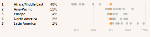
For one dot chart, the user chose a diet, using a parameter called Selected Baseline Diet.

The color of the dots in the plot would be orange if the following calculation evaluated true; otherwise it would be gray.

In the chart, the five regions would be sorted in descending order of adherence to that diet, and along each region, the eleven diets would be plotted as appropriately colored circles.

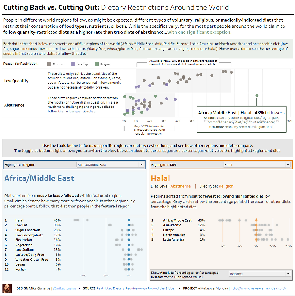
For the other dot chart, it would work the same way with similar parameters and fields. The user could choose a region; the 11 diets would then be sorted in descending order of adherence within that region, and along each diet, the five regions would be plotted as dots—all gray, with the selected region in blue.
This way you can always easily see how a region or diet of interest compares along and across its own/the other dimensions.
5. Calculate Relative Difference Between Other Values and the Highlighted Value
Why: Because the absolute value might not be the interesting feature to the user
There is a chance that a user might not care so much about what specific percentage of people in Latin America are on a Low-Fat diet; they might care more about whether Latin America has the highest percentage of people on a Low-Fat diet of all regions; or, whether they tend to follow diets of any kind more or less frequently than other regions.
This is much easier to see if you line up your highlighted values right down the center of your chart, all at 0, and plot every other dot in a position relative to the highlighted one. In order to do that I created calculated fields, using LOD calculations, to plot all marks relative to the highlighted one.
This field figures out what the baseline value is for every row in the chart that highlights by Diet.

The relative difference is measured for every Diet mark in the row against the baseline, or highlighted, Diet mark.

In this relative view, for every Region, the Highlighted mark is the central (zero) value, and other dots are plotted relative to that zero value.

6. Parameter-Driven Axes
Why: Because we went through the trouble to make absolute and relative scales possible
At this point, while it’s possible to put both absolute and relative charts on the dashboard, that’s a waste of space and duplication of mental effort. It’s a better user experience if we just create a toggle, using parameters, to let the viewer decide whether to show absolute percentages or the change in percentage relative to the highlighted value. Again, this gives more flexibility for a user who may have questions that we don’t have any way of predetermining. Instead of me choosing which would be preferable, we give that option directly to the user.
Technically this is accomplished by creating an “absolute or relative” parameter.

Then, make a calculated field that reads the value of the parameter, and returns either the absolute percentage or the relative percentage.

Put that calculated field in the view as your X axis (or your Column, if you prefer), and add the parameter to the dashboard.
7. Fake Field to Space Out Columns
Why: Because I’m picky
I wanted my percentages to be right-aligned in my chart, but I hated how they were jammed right up to the dot plot.

I added a meaningless column between the percentage column and the measure values called “Spacer.”

It’s just spaces, but that way I can manually adjust the padding between the two things that were previously jammed up together.

8. Properly-Formatted Axes
Why: Because a relative axis implies that some values will be less than the key value, and some will be more; so, the axis labels should have – or + prefixes
In a perfect world, the “absolute or relative” parameter would also be able to change the formatting of the axis labels. If “absolute” is selected, I would want the percentages to be the axis labels; but with “relative” selected, I would want a “+” prefix in front of any positive percentage, a “-“ in front of the negatives, and maybe “Even” or “Equal” to show up instead of “0%”.
Unfortunately, this isn’t possible (as far as I know), so I compromised. “0%” always shows up as “0%,” because on the absolute chart “Even” or “Equal” doesn’t make sense as the zero value. On all charts, positive percentages have the “+” prefix, because I really wanted the relative chart to strongly differentiate plus versus minus.
You do this by choosing "Custom" as your number format and typing in:
"+"#%;"-"#%;"0%"
9. Tooltips Showing Ranks, Absolute Values, and Relative Values
Why: Because once the user engages with the viz at that level of depth, they’ve already shown their interest in learning more about that data point in context
I chose to leave all non-highlighted marks unlabeled. This is because I felt that “others, generally vs. highlighted, specifically” was the important initial comparison to provide to users. However, there still should be a means for users to get specifics about each of those marks. That’s why the tooltips are so important.
Each of the tooltips serves as a complete menu of information about the attendant grayed out mark. In the top chart, it shows the Region/Diet combination, the absolute percentage of adherents, and the rank of that mark in both directions (how does it rank among regions for people on that diet, and how does it rank among diets for people in that region).

In the bottom charts, the Region/Diet combination is supplemented by the absolute percentage and the difference between that percentage and the highlighted mark, plus additional information about the highlighted mark.
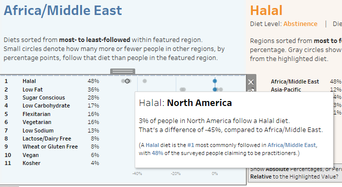
All of this information is obtainable directly or implicitly without tooltips, if you set your highlighted diet and regions correctly, but that’s not enough. If a user is engaged enough in your dashboard to hover over a mark searching for more information, it’s important to provide that information, and to provide it in the proper context.
Additionally, that data should be formatted intentionally and spaced out in a way that makes sense and is easy to read. Use full sentences if you want, or just field names and values if you want; just don’t leave the tooltips as the default format (and for the love of God, turn off command buttons).
10. Context-Sensitive Tooltips
Why: Because that level of refinement proves that everything you show is intentional
If you include tooltip data that compares the selected mark to a fixed mark, what should happen if the user highlights the fixed mark? Comparison to itself is meaningless and looks half-finished.
This was one challenge in my viz, because I wanted to compare the gray marks to the highlighted mark. However, when the tooltip was the highlighted mark itself, I didn’t want any comparison to show.
I get around this by creating “Context Tooltip” calculated fields, where we do a logical check to see if the current dimension value is equal to the highlighted dimension value; if it is, then the field returns null; if it is not, then the field returns context sensitive information.

Compare what happens when you hover over a highlighted mark, vs. what happens when you hover over a gray mark.
Highlighted:

Not highlighted:
This is much better than having the tooltip for the highlighted mark say "48% of people in Africa/Middle East follow a Halal diet. That's a difference of 0%, compared to Africa/Middle East." Well OF COURSE it is. It's the SAME PLACE.
After all this, I can’t say that I necessarily learned any one specific new technique this week. I probably haven’t actually executed all of these techniques live, in the field, before; and I certainly haven’t done so all at the same time.
But part of the goal this week was to be able to accomplish the functionality and flexibility I saw in my mind’s eye, as well as to effectively emphasize the two key analytic takeaways (one, that abstinence diets are less followed than quantity control diets; and two, the Halal diet in Africa/Middle East is a dramatic outlier).
I consider this dashboard a success, even though the public engagement level begs to differ.
They say, “No guts, no glory;” this week, the guts ARE the glory.


Comments