Greetings and salutations!
Many of you are hard at work on your IronViz submissions, which is what I SHOULD be doing, but it’s haaaaaaaaard. And I don’t waaaaaaannnaaaa.

In the meantime, let’s talk about a fun little trick that I used for this week’s Makeover Monday, one that has an extremely limited use case but is a fun little tool to have at your disposal.
I’m talking about the rotated scatterplot.
For some viz I worked on the past, I was underwhelmed by the quality of the data. I thought to myself, “Hmm, this all seems pretty slanted to me.” That led me to think, hey, SLANTED DATA. I wonder if I could, you know, take a regular chart, float it, and slightly rotate it on the dashboard so that it was “slanted” on the page?
Well, of course, you can’t do that. In graphic design tools like Illustrator and Photoshop—and even in Powerpoint—you can grab free-floating objects and rotate them. Tableau, on the other hand, is super square, daddy-o.

You can line things up vertically and horizontally however you want, and any angle you prefer is fine as long as it’s a right angle.
Well this didn’t cut it for me. So I spent some time going down a path of using trigonometry to transform the position of marks on a chart so that the data was 5 degrees slanted in one or the other direction. After a bunch of struggling I got partway there, but the formulas weren’t right, and I realized that the gridlines and zero lines wouldn’t follow along with my transformation (they’d still be at right angles, even though the data was now at a different angle), so I set it aside.
Earlier this week, I was working on a scatterplot for a Makeover Monday project, where I was comparing, for schools in each state in India, the % of usable toilets overall vs. the % of usable girls’ toilets. Across three different years and 30-some states (some states were redrawn over time), only once was the % of working toilets for girls higher than the % of working toilets overall.
In a regular scatterplot, you could show this by mapping “Girls” percentages on the Y axis and “Overall” percentages on the X axis; then draw a 45-degree angle from the origin, and say that the single dot above this line represented that outlier. However, I thought this was the perfect opportunity to use my old idea—rotate the entire scatterplot 45 degrees, so that the one dot in the top half of the resulting diamond was the outlier, and everything in the bottom half showed places and times where girls were disproportionately denied working toilet facilities.
The finished version of this included a custom background. Here’s what it looked like:
For the dashboard above, I used Photoshop to create the new axis lines and the minimal gridlines (as well as the colored triangles and some of the text). However, I thought there would probably be a way to create dynamic axes that would rotate along with the dots, so that a dashboard developer could experiment with different angles and not have to worry about creating axis lines in an outside application.
Eventually I did come up with a relatively flexible solution. Here’s a step-by-step explanation.
8/9/17 UPDATE: I added dynamic gridlines and axis labels, which means that I had to update the CSV that the workbook uses as the datasource for the pseudo-axes.
PHASE ONE: THE BORING DATA CLEANING PART
So, in order to make this as flexible as I could, I chose to create a simple CSV table that we will ultimately use as the data behind our dynamic axes.
To make our axes and gridlines, we’re eventually going to draw a line that starts at the top of our Y axis, has a vertex at the (0,0) point, and has a final endpoint at the end of our X axis. Because we're using a dataset that uses 0% and 100% as the data range on both the X and Y axes, the endpoints are at 100%.
We're also going to make six individual gridlines, which will mark the 25%, 50%, and 75% points on each of the two axes; they'll run from the baselines to 100% (I didn't want a gridline at the 100% mark because I don't personally like the way that looks.)
This CSV, called axis-plain.csv, has these columns:
Type : The value for this column will be “Axis” or "Grid"
GridlineID: Value is "A" for the axis line, and different letters for each stroke of the gridlines
Point Num: between 1 and 9 for the axis, with 5 being the point at (0,0); 10 or 11 for each of the gridlines
X or Y: Will be either “X-value” or “Y-value”
Value: 0, 25%, 50%, 75%, or 100%
Besides this CSV, obviously you’ll also need your actual data source. I converted the XLS for the Makeover Monday data into a CSV called india-data.csv. It doesn’t matter at all what data source you use as long as you can figure out how to get a scatterplot (or a line chart, I suppose) working from the data it provides. I know this process works for scatterplots with continuous, float values on the X and Y axes, so that’s what I’d suggest trying it with.
Last—or actually, first—I have a scaffold.csv file that contains a single column:
Scaffold 1 2
I used this file as the spine of my data source, and joined the other two CSVs to it using Join Calculations.

First you drag scaffold.csv to your data source window. Then you drag axis-plain.csv to it, click on the circles to make it a Left Join. From the left side, pick the “Scaffold” field from the scaffold.csv source; on the right side, click “Create Join Calculation…” and just type in the number 1.
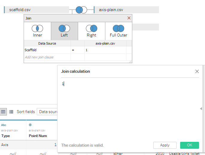
Do the same thing with your own data source (in this case, india-data.csv), except in Create Join Calculation, type in the number 2.
You end up with a combined table that has lots of Null values, which is what you want.
PHASE TWO: STILL THE BORING PART BUT AT LEAST YOU’RE IN A WORKSHEET NOW
If we were going to create a standard scatterplot from this India school toilet data, it would be easy at this point. We would drag [% Usable: ALL] to Columns, [% Usable: GIRLS] to Rows, put [State] on the detail shelf, make [Year] discrete and put it on the Color shelf, set our Marks to Circles, hide our Null values (for argument’s sake), and voila. Other than some fit-and-finish polishing, we’re done.
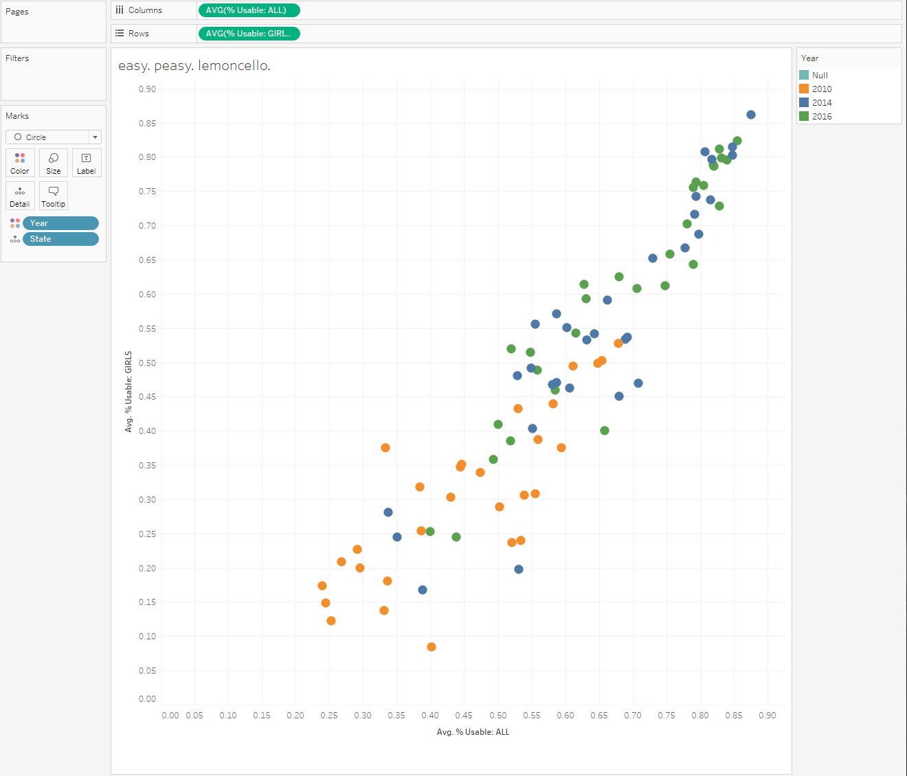
However, if we tried to put a pseudo-axis on this chart right now, we wouldn’t be able to do it. The way we’re going to accomplish that is by creating a dual-axis chart.
- One of the charts is going to show data from the india-data.csv, and will use Circles as Marks. - The other one is going to show data from the axis-plain.csv, and will use Lines as Marks. - More importantly, THEY’RE GOING TO USE THE SAME CALCULATED FIELDS in the Rows and Columns shelves.'
So, let’s start by creating some calculated fields that will give us the correct X and Y values for our Pseudo-Axis.
We’re going to create [X-values For Pseudo Axis], which looks like this:
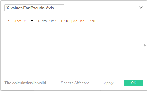
Then we’ll do [Y-values For Pseudo Axis]. I bet you can guess what that one looks like.
The point here is that the only rows in our combined datasource that have a value of “X-value” or “Y-value” in the [Xor Y] field come from our axis-plain.csv. These are the only rows we care about when drawing our pseudo axis.
(Similarly, although I skipped over it before, [% Usable: ALL] and [% Usable: GIRLS] are themselves calculated fields, and they also use logic that looks for certain values in the [Category] field; rows with non-null values in that field only come from the india-data.csv.)
Now we have two different possible X-axis fields and two different possible Y-axis fields – one each to draw the pseudo axes, and one each to draw the scatterplot. Now we will create calculated fields to determine which one of each to use.
[Select Correct X Value] leverages our null-heavy combined data source. It looks to see if there is a Null value in the [State] field, which is only the case when the original data comes from axis-plain.csv.
If it finds a Null value, then it knows that we’re trying to draw our pseudo-axes, and the value of this new field will be [X-values For Pseudo Axis].
Otherwise, the value of the field is [% Usable: ALL].
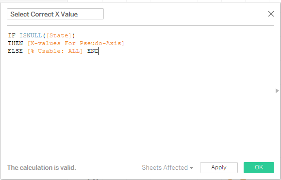
We perform similar logic in creating [Select Correct Y Value], where the ultimate value of this field is either [Y-values For Pseudo Axis] or [% Usable: GIRLS].
Now we get to the beginnings of the fun part.
PHASE THREE: SOHCAHTOA; OR, ALL THE TRIG YOU NEVER THOUGHT YOU’D WANT TO REMEMBER
When I say that we’re trying to tilt or rotate our scatterplot, I don’t mean we’re grabbing it and spinning it around the approximate middle of all the existing marks. I mean that we’re imagining that the entire plane upon which our marks are placed is a giant circle, and the very center of that circle is the origin: (0,0).
By tilting or rotating our chart, say, 30 degrees clockwise, what we are really doing is moving our chart around a circle 30/360th of a rotation, or 1/12th of the way around.
Fortunately for smoothbrains like me, the formulas for doing such things are readily available on the internet.
The first thing we’ll do is convert degrees into radians, because that’s how life works sometimes. Then, we’ll use existing trigonometric formulas to determine how much each point’s X and Y values need to change in order to accomplish our desired transformation.
While we could hard-code our preferred amount of change, we’re not Philistines. We’re going to use the elegant solution and create a parameter called [Tilt in Degrees]. I let it range from -180 to +180 degrees in steps of 5 degrees. You can do whatever you like. Then show that parameter control on a worksheet.

Next, we’re going to add a [Radianify Tilt], a calculated field to convert this user-provided Tilt in Degrees value into radians. Truth in advertising.

You might note that there’s a minus sign in front of the parameter in that formula; I wanted a positive degree change to be reflected in a clockwise transformation; by default, the change would have been counterclockwise, so I inverted it.
Now we apply our trigonometry. To change the X values, we use the formula (X * COS theta) – (Y * SIN theta), and for the Y values we use (X * SIN theta) + (Y * COS theta), where theta is the change in degrees, converted to radians.
I’m sure you all remember that the sine of an angle is the ratio of the length of the side of a right triangle opposite that angle to the length of the hypotenuse of that triangle? And that cosine is the length of the side of a right triangle adjacent that angle to the length of the hypotenuse of that triangle?
Well, don’t worry, the formulas are already written out even if you don’t necessarily understand all the under-the-hood parts. We’re going to use our calculated [Select Correct X Value] and [Select Correct Y Value] fields when we create these new ones, which will be called [Left Tilt X Value] and [Left Tilt Y Value].
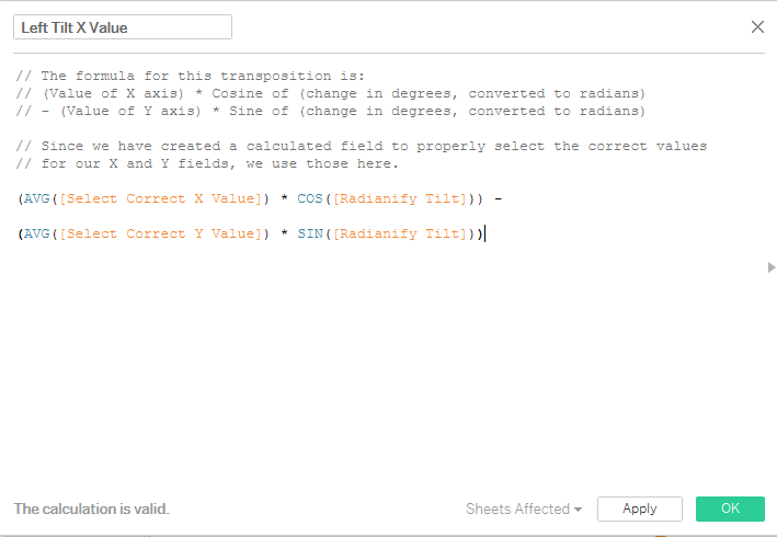
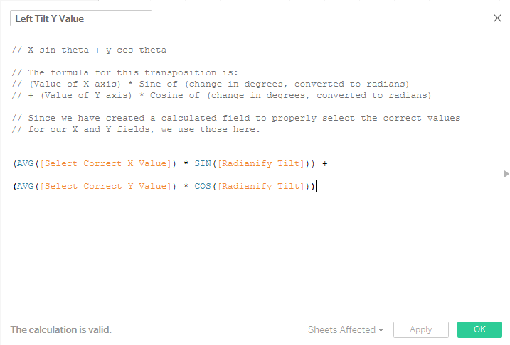
Why did I call them “Left Tilt” instead of just “Tilt”? Because I never changed them from long ago in the process, when those names were more accurate. I didn't notice that they were inaccurate until just now. And that’s the truth.
PHASE FOUR: BUILDING THE ACTUAL WORKSHEET
Oh boy! Finally we get to drag things into the worksheet!
Let’s start by putting [Left Tilt X Value] into columns and [Left Tilt Y Value] into rows.
From there, change the Marks card to Circles, and add [State] to detail and [Year], as a discrete Dimension (blue pill), to the Color card.
In your Color card, right click on the “Null” value and select “Hide”. DON’T select Exclude. Just hide them. You can also turn off the null indicator in the bottom right if it bothers you. It bothers me, so I do it.

Now, you’re going to create a dual axis chart by duplicating (Control-dragging) [Left Tilt Y Value] in your Rows card. In the Marks card for that new pane, switch the Marks type to Line, put [Point Num] on Path, and [Type] on Color. (Remove [State] from that card, too, if you haven’t already.)
You’ll probably have what looks like an axis in one color (orange, most likely), and a single dot in the middle of that pane in blue.
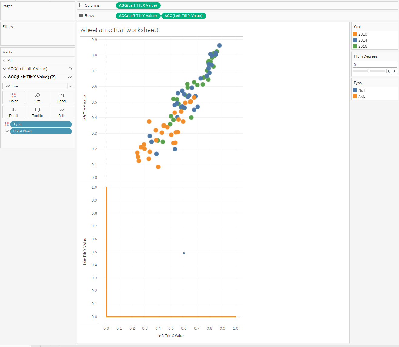
Just like before, go to the Color card under Type and hide (DO NOT EXCLUDE) the Null values. Then change the orange axis color to be gray, or black, or something less aggressive than orange; also, change the gridlines to be a different, even more subtle color. You could use the Size card to make these lines thinner too.
Now go back to the Rows card and make your Dual axis, and then Synchronize your axes as well.
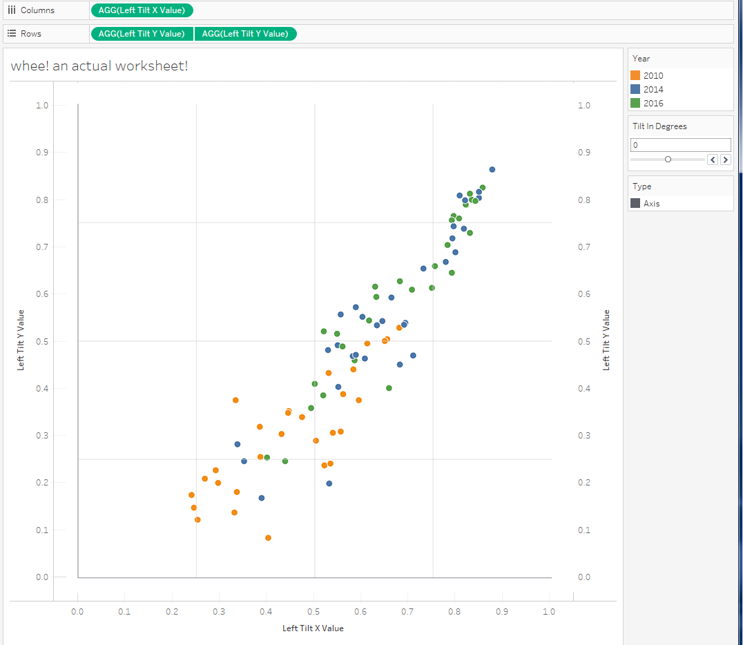
You’ll probably, at this point, want to turn off all the default formatting of row and column borders, gridlines, zero lines, axis rulers, etc. They’re going to look weird as heck when you start turning your plot in all different directions.
This is a good time to create your axis labels. We'll create calculated fields to ensure that only one value shows up per axis, and that none show up on the gridlines.
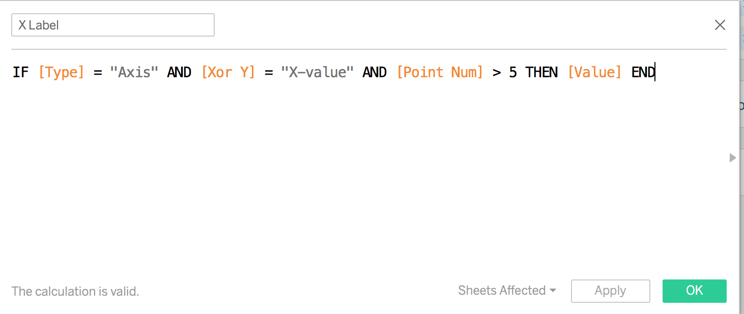
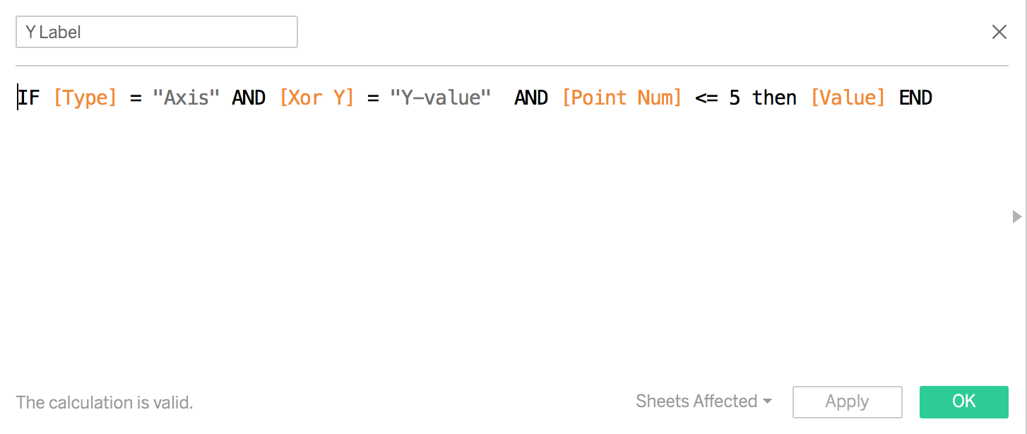
A fun thing about these axis labels is that they will always be in the right place, but won't read at an angle. Unless you change the values in the Text card, they'll always be horizontal and easily readable, no matter how tilted your scatterplot gets.
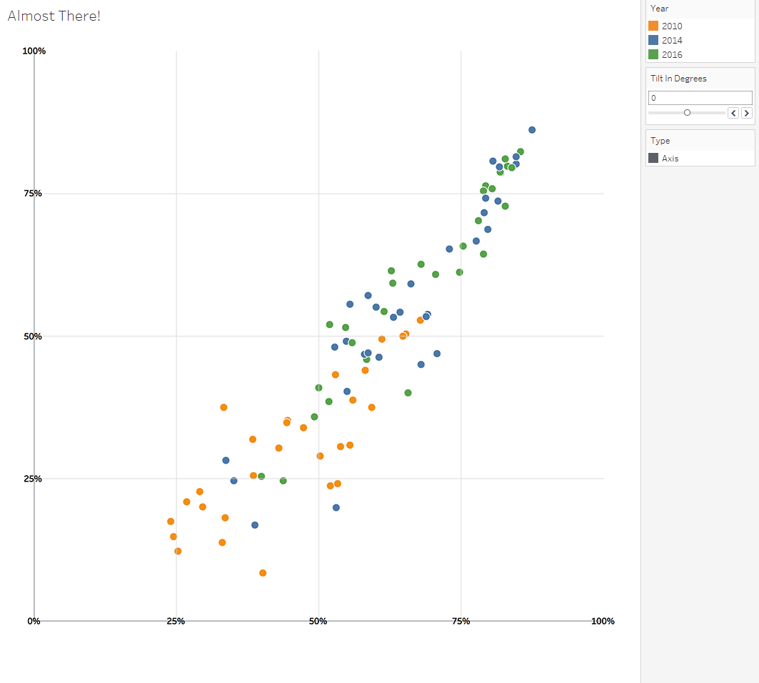
Also, you’ll want to hide all your headers, and set your worksheet/dashboard tile to Entire View instead of Standard.
PHASE FIVE: FUN TIME
You’re done! Now all you have to do is play with your parameter control to get the angle you want. The pseudo-axis should follow along with your data.
Yes, you lose out on having gridlines or reference lines (because, again, Tableau is square), and it’s still kind of a dirty hack to get everything flowing properly together, but it will get people’s attention when you have a rakishly askew scatterplot, or line chart, jauntily communicating whatever message your data shows.
In this workbook, I’ve left the super-ugly default tooltips in, so it’s easier to see what every field’s value is. If you put this into production somewhere, pinky swear that you’ll fix that. Please and thank you.
Enjoy!